From Gritty to Vibrant: Exploring the Visual Styles of Third-Person Shooters
6 December 2024
Ah, third-person shooters–the mystical land where you can stare at your character’s back for hours while racking up a body count that would make Rambo blush. But let’s be honest: not all third-person shooters are created equal. Some transport you to gritty landscapes that feel like they’ve been drenched in coffee stains and bad decisions, while others throw you into vibrant worlds so colorful that they make Lisa Frank notebooks look like grayscale sketches. Today, we’re taking a wild (and slightly sarcastic) ride through the visual styles of these games, from the dark and brooding to the eye-poppingly vivid.
So, strap yourself in, grab your oversized digital gun, and let’s dive into the glorious mess that is the visual identity of third-person shooters. 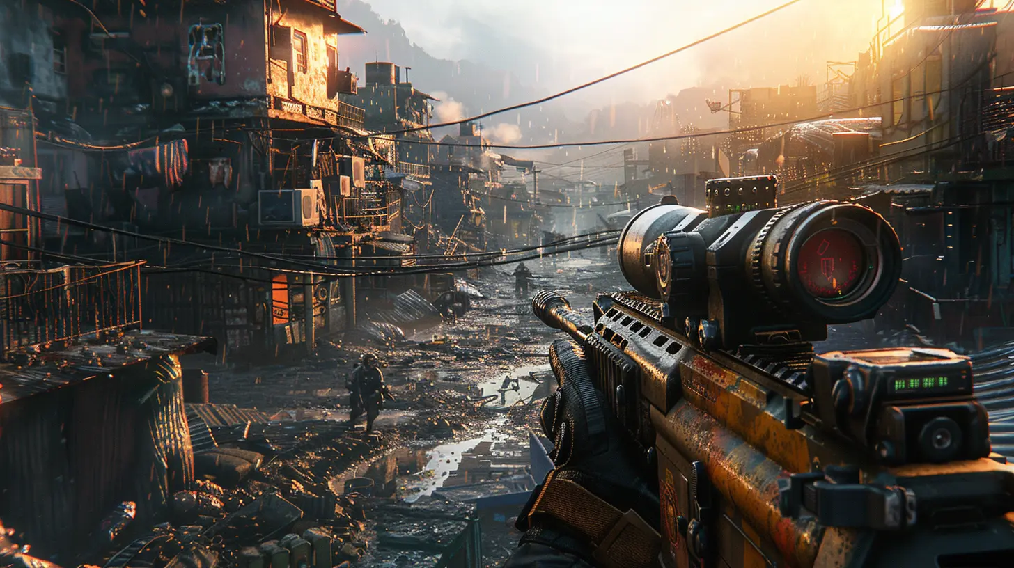
What’s With All the Brown?
Let’s kick things off with the elephant in the room: why are so many third-person shooters drowning in shades of brown and gray? Seriously, some of these games look like a moving Pinterest board for “industrial chic” gone wrong. Take Gears of War, for instance. Don’t get me wrong, it’s a fantastic game, but the color palette? It’s like Marcus Fenix’s entire world was put through a sepia filter and then drowned in mud.These gritty visuals are meant to evoke seriousness. Apparently, nothing screams "war is hell" like a world devoid of any color that isn’t beige. It’s like developers went to an art class where the only paint they were allowed to use was whatever was leftover from a 1950s detective movie. Sure, it makes sense for the setting (post-apocalypses aren’t known for their rainbows), but after a while, you start craving something brighter than military camo.
But wait, you might argue, “What about the immersion?” Immersion is great, but can you really tell me you’re fully immersed in a game when you’re squinting at your TV because every enemy blends into the background like a bad camouflage experiment? I’m looking at you, The Division. 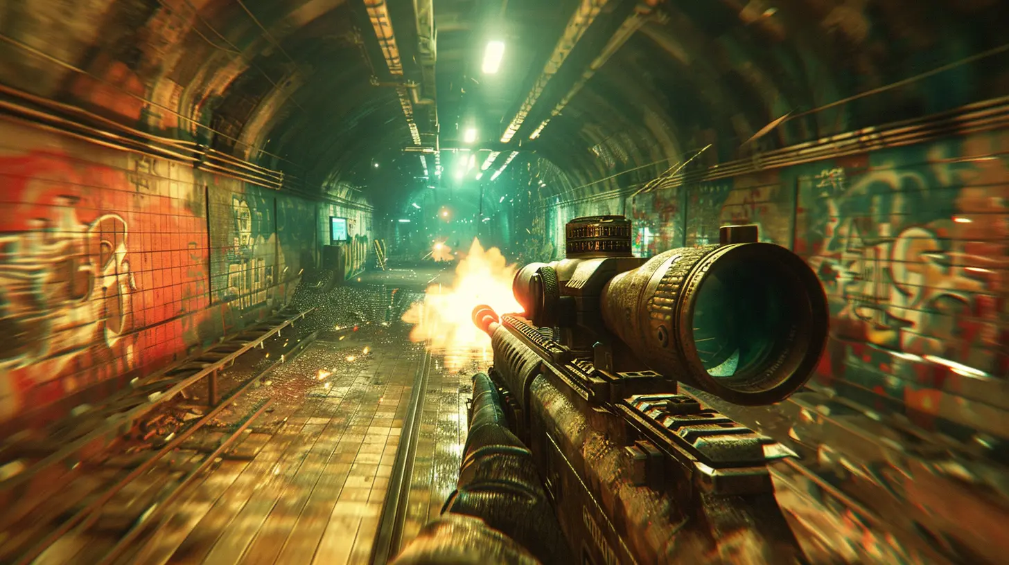
The Rise of Vibrancy: Thank You, Fortnite?
Now, contrast that with a game like Fortnite. Yeah, yeah, I know you just rolled your eyes hard enough to see your brain. But you can’t deny that Fortnite is a visual treat. Bright colors, cartoonish characters, and environments that have all the seriousness of a Saturday morning cartoon? Chef’s kiss.It’s like the developers decided, “What if we made a third-person shooter but actually fun to look at?” Shocking, right? And there’s something refreshing about running around in a banana suit while wielding a llama pickaxe in a landscape that looks like Andy Warhol designed it.
This push toward vibrant visuals doesn’t just start and stop with Fortnite. Games like Overwatch (yes, I know it’s technically a first-person shooter, but let me have this one) and even Apex Legends lean heavily into bold palettes and striking designs. It’s almost as if the industry woke up one day and thought, “Hey, what if players might want to see orange once in a while?” Revolutionary stuff.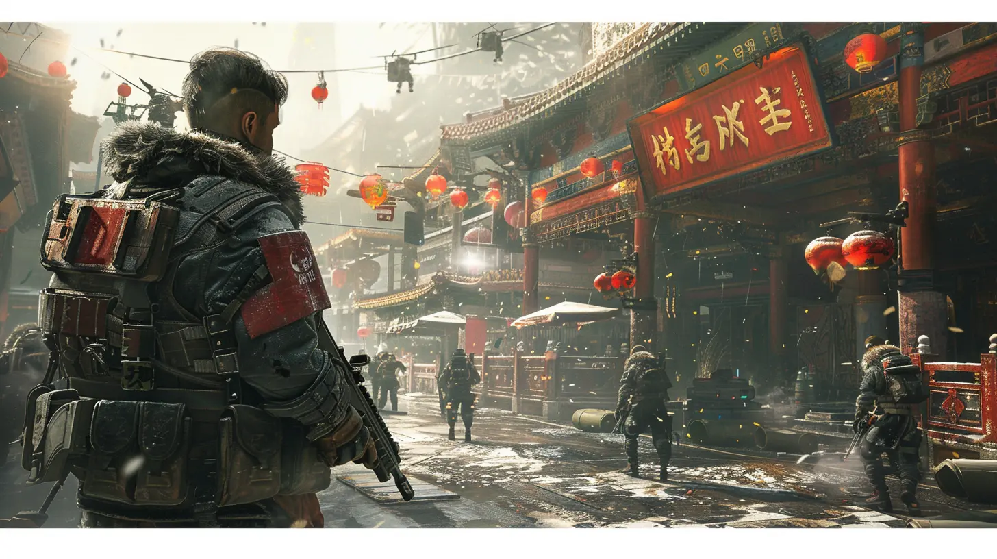
Realism: The Middle Child of Visual Styles
Then, of course, you’ve got the games that try to tread the middle ground—neither too gritty nor too vibrant. These are the ones that say, “We’re not Gears of War, but we’re not Splatoon either.” Think Uncharted or The Last of Us. These games still have detailed environments and realistic character models, but they’re not afraid to add a dash of color here and there.Take Uncharted 4: A Thief’s End, for instance. The lush, tropical environments are stunning without looking like someone dumped a bucket of Skittles on them. Meanwhile, The Last of Us uses softer, more natural hues, like greens from overgrown foliage or the warm, muted tones of a sunset, to create mood without draping the entire game in concrete gray.
They’re like the porridge in Goldilocks’ house—"just right." (Although let’s be honest, if you’re playing The Last of Us, you’re too emotionally destroyed to properly admire any of the visuals.)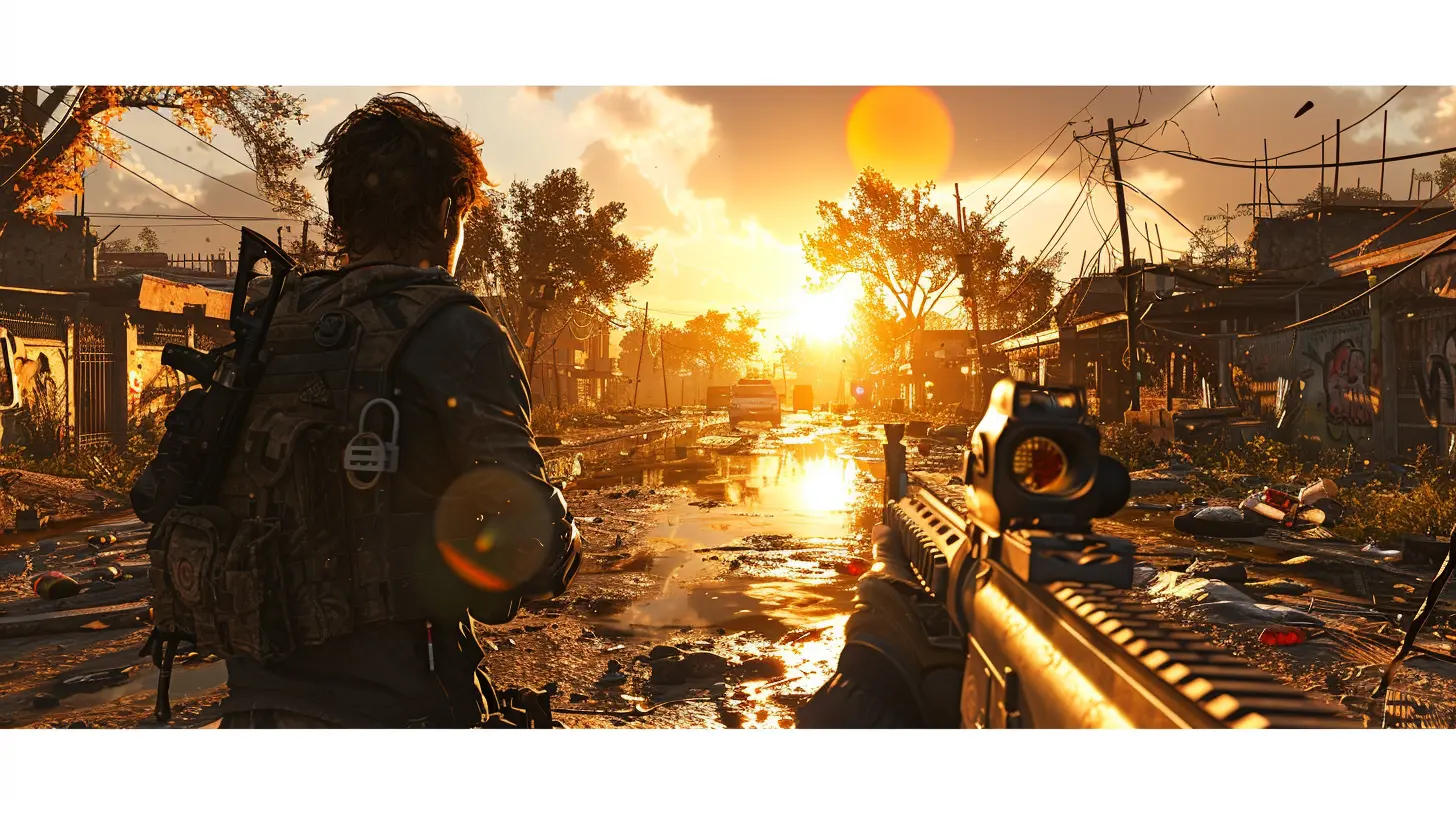
Why Visual Style Matters: Spoiler, It’s Not Just About Looks
Okay, but let’s get to the heart of the matter—why does any of this even matter? Isn’t gameplay king? Sure, but to quote every motivational poster ever: "first impressions count." Visual style is often what draws us into a game in the first place. People don’t boot up Control because they’re dying to feel like a janitor in a suit (I mean, maybe they do, no judgment), but because the visual style is so uniquely trippy and mysterious.Visual style also plays a massive role in creating a game’s identity. Think about it: without its colorful world, Fortnite would just be “that battle royale with building mechanics.” Without its gritty style, Gears of War would just be “that game where guys have suspiciously large necks.” The color palette, the lighting, the environment design—it all shapes how we feel when we play.
And let’s not forget clarity. Ever try to spot an enemy in a hyper-realistic game when it’s raining, foggy, and everything looks like wet concrete? Yeah, good luck with that. A vibrant game, on the other hand, might make it easier to pick out targets, even if it makes less logical sense (cough shooting a guy in a neon pink hoodie cough).
The Hybrid Approach: Best of Both Worlds?
So, is there a perfect balance between gritty and vibrant? Some games seem to think so. Take Mass Effect, for example. It blends sleek, futuristic designs with darker, moodier tones to create a setting that feels both realistic and fantastical. Plus, you get the occasional splash of color from alien worlds or biotic powers, so you’re not stuck staring at endless corridors of spaceship gray.Then there’s Red Dead Redemption 2, which somehow makes the Old West look both rustic and breathtakingly beautiful. It’s earthy, but not boring, with sunsets so stunning they could make Bob Ross shed a tear. It blends realism and artistry in a way that feels…well, perfect.
The hybrid approach may not be as flashy as Fortnite or as hardcore as Gears, but it’s got its own charm. It’s like the vanilla ice cream of visual styles—it might not be anyone’s favorite, but everyone can agree it’s pretty solid.
What Does the Future Hold?
Looking forward, it’s hard to predict where third-person shooters will go visually. Will we see a return to grimy, hyper-realistic environments as developers flex their ever-growing graphical muscles? Or will the trend toward vibrant, stylized art continue to dominate? Maybe we’ll get some weird fusion of both, where everything is photorealistic and rainbow-colored. (Imagine gritty soldiers running through a neon pink dystopia—sounds absurd, but kind of awesome, right?)One thing’s for sure: we, as gamers, will complain no matter what happens. If it’s too gritty, we’ll moan about how “dreary” everything looks. If it’s too colorful, we’ll whine about how it breaks immersion. And if it’s somewhere in between? Well, clearly it’s trying too hard.
Hey, we’re nothing if not consistent.
Conclusion: Pick Your Poison
Whether you prefer your third-person shooters to look like a walking postcard for depression or a psychedelic fever dream is entirely up to you. Both styles have their merits—and their downsides. Gritty visuals can draw you into a harsh, unforgiving world, but they can also feel monotonous. Vibrant aesthetics can make a game pop and feel alive, but sometimes you want a little less sugar and a little more salt.At the end of the day, games are art. And just like art, the beauty of a visual style lies in the eye of the beholder—or, in this case, the person who spends eight hours straight crouch-rolling through virtual battlefields.
So, whether you’re team “gritty as my uncle’s beard” or team “brighter than a rave playlist,” just remember: you’re here to have fun. And maybe shoot a few hundred bad guys along the way.
all images in this post were generated using AI tools
Category:
Third Person ShooterAuthor:

Audrey McGhee
Discussion
rate this article
12 comments
Sheena Barker
This article effectively highlights the evolution of visual styles in third-person shooters, illustrating how aesthetics enhance gameplay and player engagement across the genre.
February 1, 2025 at 5:04 PM

Audrey McGhee
Thank you! I'm glad you found the article effective in showcasing how visual styles contribute to gameplay and player engagement in third-person shooters.
Delia Carter
This article effectively contrasts the evolving visual styles of third-person shooters, highlighting how aesthetic choices influence player experience and narrative engagement in gaming.
January 29, 2025 at 4:52 AM

Audrey McGhee
Thank you for your insightful comment! I'm glad you found the article's exploration of visual styles and their impact on player experience and narrative engaging.
Camille McMahon
Great article! It's fascinating to see how visual styles in third-person shooters have evolved. Your insights into the shift from gritty to vibrant aesthetics really highlight the creativity in game design!
January 25, 2025 at 4:27 PM

Audrey McGhee
Thank you! I’m glad you enjoyed it and appreciate your thoughtful insights on the evolution of visual styles in gaming!
Sarina McNair
Embrace the evolution of visual storytelling in third-person shooters! Each style offers a unique adventure that ignites our imagination and pushes the boundaries of gaming art. Let’s celebrate creativity!
January 22, 2025 at 5:11 PM

Audrey McGhee
Absolutely! Each visual style brings its own flair, enhancing gameplay and enriching our storytelling experiences. Let's continue to celebrate this artistic evolution!
Myles Summers
This article brilliantly showcases the evolution of visual styles in third-person shooters, highlighting the shift from gritty realism to vibrant aesthetics. It’s fascinating to see how these artistic choices influence gameplay and player immersion. A must-read for fans and developers alike, as it opens up new perspectives in game design!
January 15, 2025 at 5:21 PM

Audrey McGhee
Thank you! I'm glad you found the article insightful. It's exciting to explore how visual styles impact gameplay and player experience!
Zinna Morrow
Between shadow and light lies a story untold. What secrets do these shifting aesthetics hide? Dive deep, and you may uncover more than just visuals.
January 11, 2025 at 5:40 PM

Audrey McGhee
Thank you for your thoughtful comment! Indeed, the interplay of shadow and light in third-person shooters often reflects deeper narratives and emotions, enriching the gameplay experience beyond mere visuals.
Bear Campbell
Great insights! I love how visual styles can deeply influence gameplay and player immersion.
January 4, 2025 at 4:53 PM

Audrey McGhee
Thank you! I'm glad you enjoyed it—visual styles truly play a crucial role in shaping player experiences.
Seth McGehee
Who knew third-person shooters could be so colorful? From gritty battles to vibrant sunsets, let's paint our way to victory!
December 29, 2024 at 5:46 AM

Audrey McGhee
Thank you! It's fascinating how visual styles in third-person shooters can enhance storytelling and immersion. It's a vibrant evolution!
Zaid Bryant
Loved this exploration of visual styles! It’s fascinating how the shift from gritty to vibrant can change our gaming experience. Can’t wait to see how future titles blend these aesthetics! Keep up the great work!
December 24, 2024 at 6:04 PM

Audrey McGhee
Thank you! I’m glad you enjoyed the exploration—it's exciting to see how visual styles evolve in gaming. Stay tuned for more insights!
Iris King
Can visuals shape our very gaming reality?
December 19, 2024 at 4:53 PM

Audrey McGhee
Absolutely! Visuals play a crucial role in shaping our gaming experience, influencing mood, immersion, and even gameplay mechanics.
Zevros Jordan
Embrace creativity—every style tells a unique story!
December 14, 2024 at 4:46 PM

Audrey McGhee
Absolutely! Each visual style in third-person shooters adds depth and character to the storytelling experience.
Iris Lee
Love how third-person shooters blend gritty realism with vibrant aesthetics—always keeps gameplay fresh and engaging! 🎮✨
December 10, 2024 at 5:52 PM

Audrey McGhee
Thank you! It’s fascinating how these contrasting styles enhance immersion and keep players hooked. Glad you enjoyed the article! 🎮✨
MORE POSTS

Exclusive Games and How They Shape the Gaming Platform Landscape

Can Pay to Win Games Be Ethical?

PC Gaming Platforms: How Steam Dominated the Market

How to Recognize a Game That Will Become Pay to Win

Building History: The Importance of Lore in World Building

Exploring Orchestral Scores in Strategy Games

Creating a Living City: How to Populate Urban Spaces in Games

Quick and Easy Local Multiplayer Games for Busy Gamers